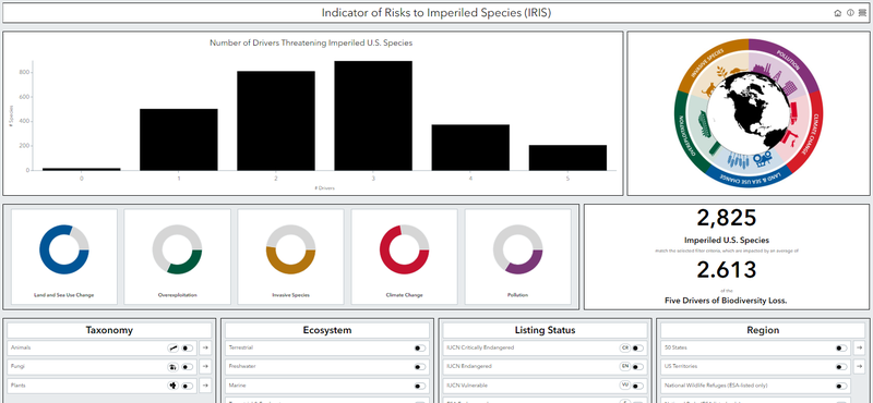
This dashboard allows you to examine linkages between the five main drivers of global biodiversity loss (i.e., land- and sea-use change, overexploitation, invasive species, climate change, and pollution) and U.S. species listed under the Endangered Species Act or the International Union for Conservation of Nature Red List of Threatened Species. You can examine trends by taxonomic group, ecosystem, listing status, and region. Full report can be found here.